
Reporting and Analytics
Analytics - Comparing different time periods
In many cases, comparing a time period against the one before, such as Month-over-Month reports, or even comparing a time period to the same time the year before can be very beneficial in understanding the change in your usage over time.
The Current Vs Past report is designed to address this exact need. The report works by setting a time period (Today, Yesterday, past 7/30 days, past 3/12 months, and custom), and then allowing for comparison to the previous period (of the same length), or the same period last year.
To access the report, click "Analytics" in the left navigation menu, and then "Current Vs Past" in the top menu.
Select your time period.
Select the period to compare to.
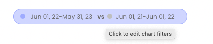
Click on the "Period vs Period" button to filter by product, pipeline, country, and domain (example below)
Alternate between the Data Transferred, Requests, and Success Rate tabs below the graph to view the respective metrics.
Below the main graph area will be a table containing detailed data for various sub-periods (hourly, daily, weekly, monthly). The periods for the data table will alternate relative to the main time period you selected above. This data can also be downloaded to a CSV by clicking "Download CSV".
Analytics - Comparing performance over the same time period
If you collect web data, chances are you collect from multiple sources, for multiple purposes, or have some level of diverse geotargeting/domain targeting.
The Performance Comparison report is designed to compare the usage of various metrics within the same time period. For example:
Compare how much data was transferred through a particular pipeline vs another.
Compare how many requests were sent through one country vs up to three other countries.
Compare the success rate for accessing several different domains.
The Performance Comparison report allows for creating up to 4 individual metrics - or "lines" - on the report graph. Each line consists of filters for a product, pipeline, country, or domain.
To access the Performance Comparison report, click on "Analytics" in the lefthand navigation, and then the "Performance Comparison" tab in the center.
Next, click on the time period for the report, and then click on "Line 1" to edit the filter metrics for the first line.
Click "+ Add to compare" to add additional lines to the report.
Getting a quick summary in the Dashboard home
The Nimble Dashboard's home page provides several summarized statistics that help to get quick insights into your account's status and usage.
At the top of the page, you'll see your total data transferred, total request count, and remaining budget for each Nimble product.
Below is a filter that controls the various statistics widgets that appear below and includes:
Filter by product
Filter by pipeline
Filter by country geotargeting
Filter by requested domain
Filter by time period
Below the filter are various statistics widgets including Per-product usage, request count bar chart, data transferred pie chart, top countries, and top domains.
Viewing statistics for a particular pipeline
You can drill down to view additional information for a particular pipeline by going to the Pipelines page and clicking on a particular pipeline.
In the usage tab, a graph appears that displays the total data transferred, number of requests, and the success rate for that pipeline.
Above the table are filter controls for viewing data filtered by geotargeted country, targeted domain, and time period.